Pages

Wednesday, 27 February 2013

Sustainability in Construction


source: designboom


In the West when we want to construct a building we use steel scaffolding. It is a strong, rigid material that works well for our building needs. However, it isn't the most sustainable or ethical product to be using, as steel takes a lot of energy to produce and to recycle.

In the Far East, such as Hong Kong, they use a different material for their scaffolding needs. Bamboo.

Bamboo is a very eco-friendly material. It grows very fast which makes it extremely sustainable. It's cheap and much easier to transport than steel. It can be cut and bent to any desired length or shape and is still strong enough to hold builders and materials. It takes no time at all to construct a scaffolding structure made from bamboo, without the aid of machinery and the dismantling process is just as easy.

Overall, bamboo is no brainer when it comes to a scaffolding solution. The environmental and ethical factors are just as relevant as the practical factors.

In the rapidly increasing technological world of the Far East, it is nice to see that traditional bamboo still has a place in construction.

More information can be found here.

source: designboom


Thursday, 21 February 2013

Newspaper Wood


Dutch designer Mieke Meijer and design company Vij5 have created innovate type of material made simply from recycled newspaper.


The old newspapers are glued together, once they are dry they can be cut and sanded just like normal wood and be used for just as many applications as actual wood.

 When cut, a very wood-like grain is revealed, it is very pleasing to the eye and touch. As seen in my previous post, Peugeot's Onyx concept car uses this material in it's interior.

I like the concept, the simplicity and the overall quality of the finished material and would love to see it used in more designs in the future.

More information can be found here.

Wednesday, 20 February 2013

Colours in Photography


I have made a collage of some of my more colourful photographs I've taken. Colour is a very important factor in design and photography, it can affect the whole mood and feel of the piece.

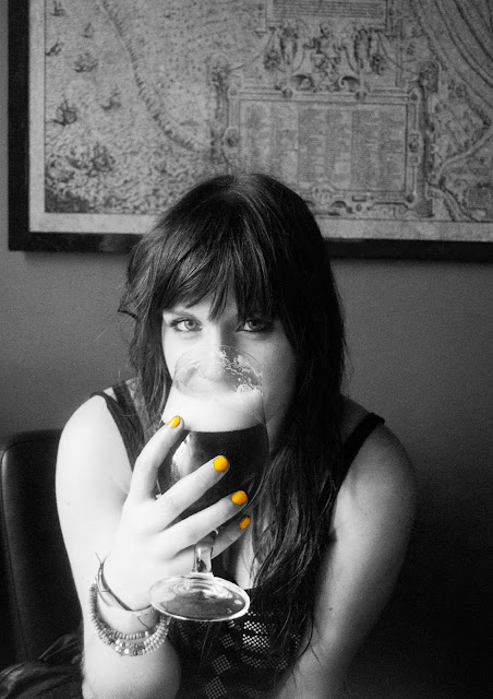
 One of my favourite things to with photographs is to remove all colour except one, this effect can really change the whole atmosphere of the photograph and guide the eyes onto a key feature within the image.

Tuesday, 19 February 2013

Onyx Concept Car

Peugeot have released a new concept car in the form of the Onyx, this futuristic motor features copper bodywork and a recycled newspaper interior. An awesome glimpse into the future of motoring! More information here.


Sunday, 17 February 2013

The Big Sleep cover design competition

I am aiming to enter the Penguin Design Award competition. This year, entrants are tasked with designing with the symbolic crime/detective novel by Raymond Chandler.

After reading the book, there is a few scenes and characters that could be used in a design concept.


Below are a few examples of previous cover designs, all have a common theme of guns and girls, it's my feeling that these themes have been used to death for this type of novel, so I'm looking to create something slightly different...


I have created a preliminary mock up of an idea I've had, as seen below:

I have used a very simple graphic image, with the main character  casting a shadow of a knight chess piece in a doorway. The Knight idea came from the running theme in the book of Marlowe (the lead character) being a knight in a dirty, corrupted world.

The deadline for competition submissions is the 9th of April, I have some more development work to do to be ready for that approaching deadline. 

Friday, 15 February 2013

Bruges - Photoset

Photographs from my recent trip to Bruges, Belgium. It was freezing cold and very icy, but a good adventure nonetheless.


Wednesday, 6 February 2013

Spyker Graphics


For my last Design project I created a selection of graphic pieces for the Dutch Sports Car firm; Spyker.

I used orange as a running theme as it is a strong, bold colour and has connotations of the Netherlands. I enjoyed this project and I'm proud of the outcome.

Fuel - Escape Kit

A Really Cool branding post from the Escape Kit blog, love the font used and the overall retro feel. Right up my street! View it here

London - Photoset

I went to London in January and got some good shots of all the typical sights you expect, I was excited to see the Shard for the first time!